Did you know, that colors have a voice of their own and they speak in diverse tones?
When it comes to colors, many people are usually inclined to
choosing something they like or are comfortable with, like their favorite
colors.
However, when it comes to branding for business and choosing colors for your brand identities, designs and print materials, there are certain principles that should be taken into consideration to reflect an organized entity and professionalism as a business.
This is because colors have over the years been associated
with certain interpretations and meanings and there are also some rules pertaining
to color application. These need to be considered, for a brand to be well
positioned, attractive and still reflect its brand’s values.
Let’s begin with the basic things, we think you should know about colors.
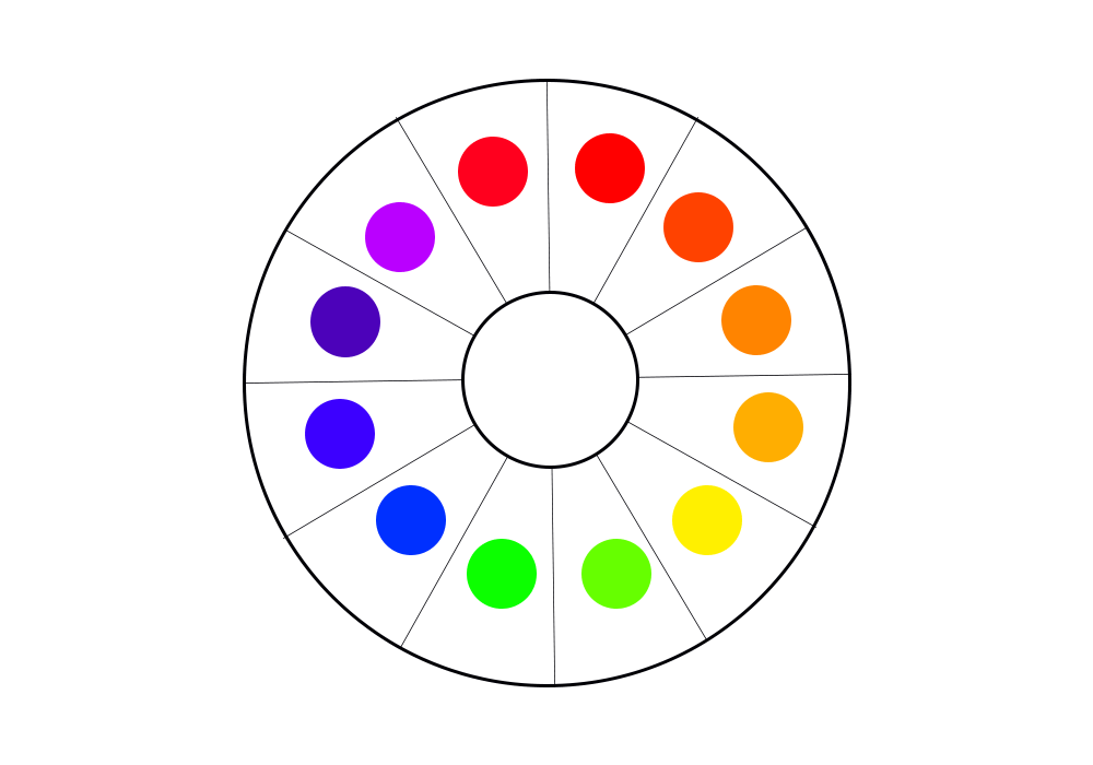
The Color Wheel
The color wheel reflects the primary colors (any color that cannot be made from the
combination of other colors), the secondary colors (colors derived from mixing two primary colors or additive primary
colors in equal proportions) and tertiary colors (colors derived from the combination of a primary and secondary color in
equal proportions).
The color wheel is the foundation of any brand’s color application for design, as well as its brand identity and colors choice; whether you choose to make use of primary, secondary or tertiary colors or other colors that can be derived from the combination of any of these three.
This Includes the use more or less saturation (lightness, with the combination of the white hue and any other color) or more of less value (darkness, with the combination of the black hue and any other color).
Your choice of colors should reflect your brand’s values and the kind of image it intends to project to its target audience.
This is why certain well-known global brands, as well as smaller brand have over time selected specific colors for their brand identity.
As we go through the meaning of some predominant colors, think of well-known brands and why they may have selected certain colors to represent their business.
Below are summaries of some of the most principal colors and their meanings.
The Primary Colors
Red, know to reflect: Passion, energy, love, romance, danger, style, excitement, pain, bravery, active, bold, power, ambition, youthfulness and assertiveness.
Yellow, know to reflect: Joy, cheerfulness, friendliness, intellect, energy, warmth, caution, optimism, understanding and smartness.
Blue, known to reflect: Stability, leadership, trust, responsible, truth, confidence, calmness, tranquility, affection, success, loyalty, authority, peace and sincerity.
The Secondary Colors
Orange, known to reflect: Creativity, productivity, thoughtfulness, warmth, instinct, freedom, impulse, motivation and new ideas.
Green, known to reflect: Growth, clarity, generosity, freshness, life, money, safety, healing, environment, hope, youth and nature.
Purple, know to reflect: Vision, royalty, diplomacy, fashion, dignity, passion, spirituality, luxury, wisdom, magic, plentiful and loyalty.
Other Dominant Colors
Black, known to reflect: Sophistication, power, mystery, death, grief, strength, finesse, subtlety and infinity.
White, known to reflect: Purity, cleanliness, peace, goodness, simplicity, hope, freshness, light and coolness.
Gold, known to reflect: Supremacy, royalty, creativity, warmth, loyalty, friendliness, loyalty and strength.
Silver, known to reflect: stability, authority, security, strength of character and maturity.
Color Use and Branding
After examining all of these colors and some of their generally acceptable meanings. You may be very tempted to make use of a lot of them for your brand representation. This is quite understandable, since many of them reflect some very good and desirable qualities and values.
However, this is not always the smartest route, especially when choosing colors that would in the long run reflect your brand’s values, style, creativity and organization.
Your vision and mission statement for your brand, as well as service offerings should be carefully considered before the choice of brand colors are made, such that your color choices remain pleasing to the eyes and reflect balance.
Below are some formulas that can help you decide on how you could combine certain colors, taking into consideration the color theory rules and application.
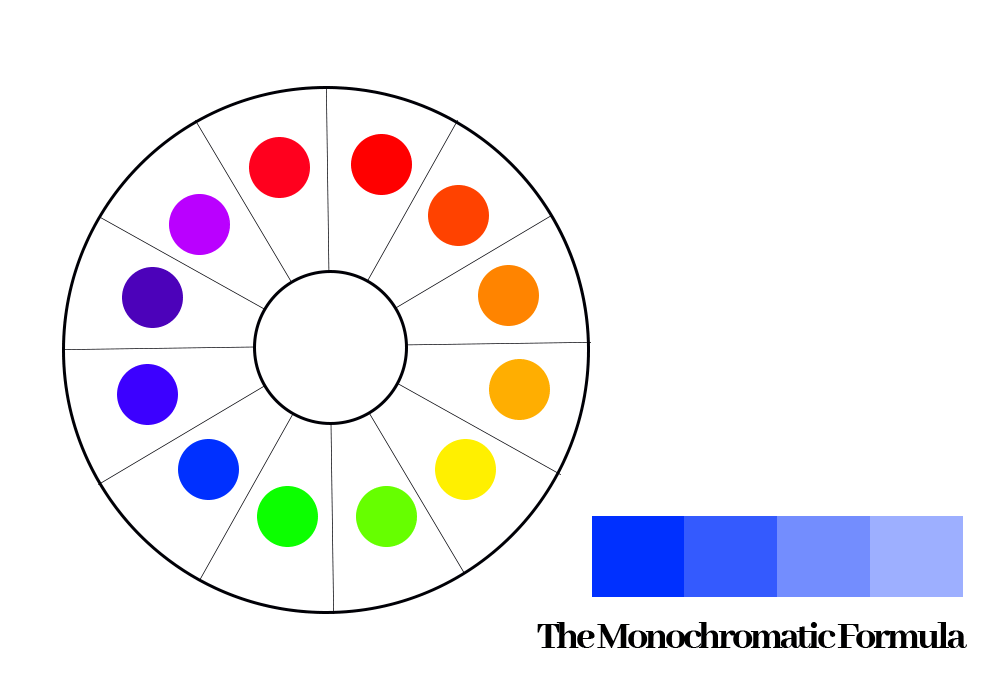
The Monochromatic Formula
This entails that the application of a single hue from the color wheel, with the combination of more or less saturation or value. Say you picked a blue hue.
You would eventually have a variety of that specific shade of blue to be applied consistently across your brand identity, designs and brand assets.
Think of brands you know that may have applied this concept, that would help with more insight.
See the image sample below for better understanding.
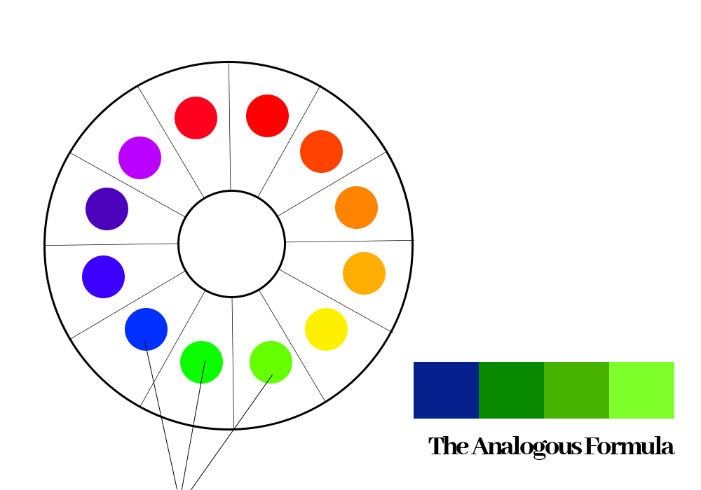
The Analogous Formula
This entails the application of three hues that appear next to each other on the color wheel, with the combination of more or less saturation or value of any of these hues selected.
This gives your brand a lot of creative room for color application and use for your brand identity, designs and brand assets.
Think of brands you know that may have applied this concept, that would help with more insight.
See the image sample below for better understanding.
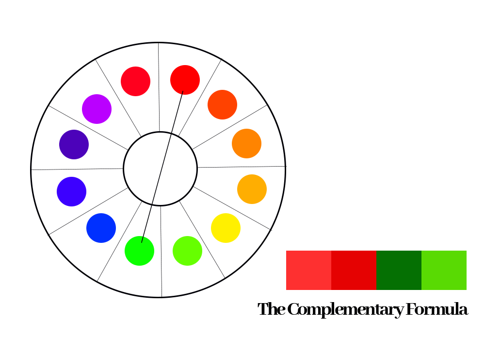
The Complementary Formula
This entails the application of any two colors directly opposite each other on the color wheel with the combination of more or less saturation or value. Say you picked a red hue, the complimentary color for this hue on the color wheel will be the green hue.
You could decide to apply these two selected complementary colors using a specific saturation or value consistently across your brand identity, designs and brand assets.
Think of brands you know that may have applied this concept, that would help with more insight.
See image sample below for better understanding.
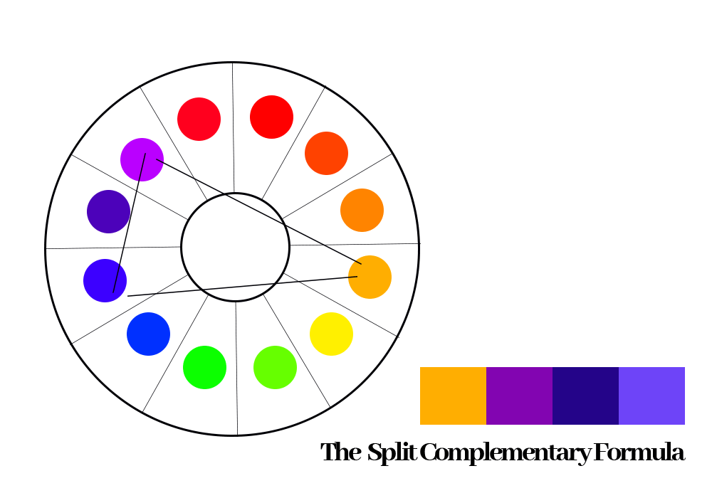
The Split Complementary Formula
This entails the application of any hue on the wheel and two opposite colors to it on the color wheel, with the combination of more or less saturation or value.
Say you picked the orange hue on the color wheel. The split complementary colors for orange would be the green and blue hues.
You could choose to apply these three selected hues using a specific saturation or value consistently across your brand elements, designs and brand assets.
Think of brands you know that may have applied this concept. This should help with more insight and creativity.
See image sample below for better understanding.
The Triadic Formula
This entails the application of any three (3) equally spaced hues from the color wheel, using a triangular method of selection (an equilateral triangle).
This can be a very dicey method of color application, however care must be taken to ensure that the three selections are not hard to the eyes and remain balanced.
This can be achieved by applying more or less saturation or value to the three selected colors.
Think of brands you know that may have applied this concept. This should help with more insight and creativity.
See image sample below for better understanding.
The Tetradic Formula
This entails the application of any four (4) hues from the color wheel, using a rectangular method of selection.
This also has to be selected carefully using a suitable saturation or value of the selected hues and applied across the brand identities, designs and brand assets.
Think of brands you know that may have applied this concept. This should help with more insight and creativity.
See image sample below for better understanding.
Conclusion
Even though these are great formulas that can be followed when creating designs for your brand’s assets or designing in general.
Don’t be afraid to think outside the box or try something new or unique.
Remember, there is beauty in moderation and balance, but there is also a beauty that comes with variety. As long as your choice of colors are balanced and have great contrast, without being hard to the eyes. This ensures that such designs or branding efforts remain attractive, irrespective of your colors choices.
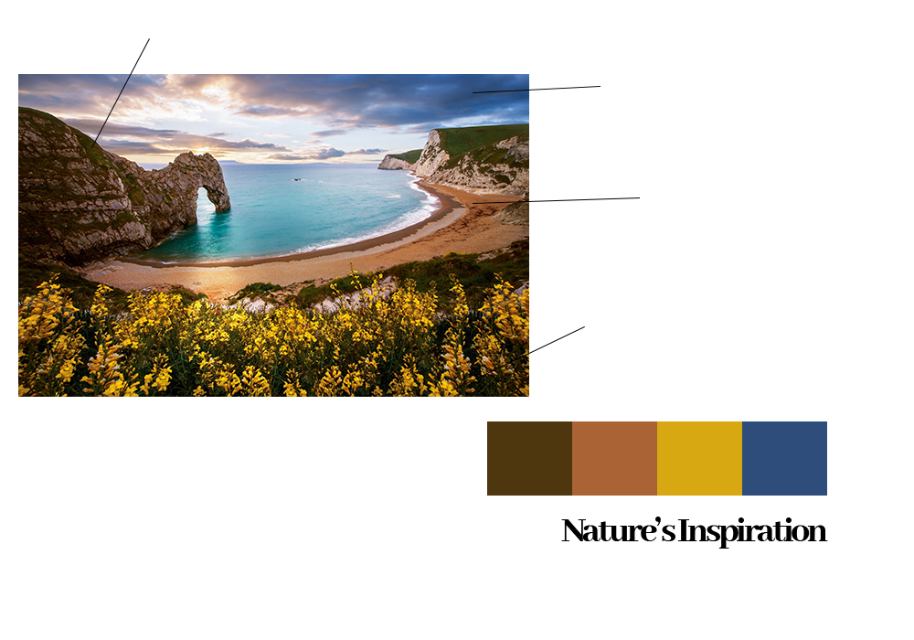
Don’t also be skeptical about nature’s inspirations.
Some of the best designs and color combinations of all time for some brands have been obtained from the natural things around us.
Also remember to generously make use of neutral colors: white, black and grey (using a saturation or value of hue that comes off as most suitable for each design) to bring balance to your all of your branding and design efforts.
We hope all of these information remains helpful in making concrete decisions about your choice of brand colors for your brand identity and design efforts.
Article by Opeolu Adeyemi.
Corporate Communications and Public Relations Consultant
Founder, Brave Publicity Ink!