Posted in Autobiography, Guest Post, Inspiration, Public Relations, Women

Brave Icon: Meet Brenda McWilson-Okorogba, our very own #MomentsWithBren

Celebrating an #Iconic Woman, Learning Experience Designer, Grant Writer, Training Facilitator, and Positive Psychology Coach, Brenda Mc Wilson-Okorogba.

Tribe: Woman, Business Woman, Thought Leader, Multiple Award Winner, Learning Experience Designer, Grant Writer, Training Facilitator, Public Speaker, Humanitarian and Activist for Gender Parity and Peace Building.


Profile:

Brenda McWilson-Okorogba is brave icon and dynamic young woman with a global footprint. One who defies all odds and redefines success for young women globally.

Her impact in the education sector and influence in the career path of many remains so inspiring. She excels at what she does with much intention, humility and a brilliance that is undisputed, driving initiatives that continue to empower and impact positivity many globally.

Brenda Okorogba is a multiple award-winning service and learning experience designer, Grant Writer, Training Facilitator, and Positive Psychology coach with over 9-years of experience ideating, designing, and delivering outcome-based programming for diverse learners across industries, sectors, and geographies.

She has an educational background in Psychology, Biological Sciences, and Business Entrepreneurship. As a lifelong learner, Brenda is an alumna of the University of Manitoba, and a host of other reputable schools and organizations.


Her Expertise:

She is especially known for developing and giving individuals the tools to excel in very challenging roles and stages of their personal and career life. She has a passion for classroom, workplace, and community learning and a gift for creating targeted learning solutions that address relevant career, community, and business needs.

Brenda loves to distill concepts or methods into meaningful frameworks and make ideas accessible for others to learn. Brenda brings experience in youth civic engagement and leadership development, transdisciplinary research, and UDL facilitation to her role in leading program design, strategy, technical capacity building, and external outreach at Momentswithbren Consulting.

As a Learning Experience Designer and Trainer, Brenda has taught in diverse learning environments and to audiences from a multitude of socio-cultural backgrounds. To offer effective online learning, she believes in the potential of integrating creativity, learning experience, strategic thinking, and technology.

Brenda currently facilitates a workforce development program funded by the IRCC Canada that provides resettlement and broad-based services to newcomer women and Government-assisted refugees (GARs) in Ottawa. She successfully creates soft skill presentations which have helped increase the career readiness and self-improvement of diverse clients and community members.


Her Humanitarian Activities:

Brenda is also passionate about gender parity and peacebuilding. She raised awareness on the unsolved missing and murder cases of Nigerian women and girls using the hashtag #MissingAndMurderedNigerianWomen.

This campaign is to create awareness of unsolved cases and the gender-based violence meted out on Nigerian women and girls that people barely talk about. Uxoricide, Femicide, Rape, Murder, Kidnapping, Organ Harvesting, Domestic Abuse and Misogyny in the Nigerian society.

She believes that the missing and murder cases of Nigerian women are an alarming societal issue that needs to be addressed and put to an end because, every Nigerian woman deserves to live and thrive in a safe environment or society #MMNG..


Her Consultancy, MomentsWithBren:

In all her projects, Brenda emphasizes the vital need to tie learning efforts to the performance goals of the individuals, organizations, and communities. Brenda has received widespread recognition for bridging needs, skills, and opportunities across an international footprint, known as “Momentswithbren”.

She is a team player who is passionate about supporting impactful programs to improve economic opportunities for those experiencing multiple barriers to employment. She has proven experience working in personal and professional development, career coaching, and mentoring for job seekers from underrepresented communities.

Her active curiosity enables her to think, see and hear from a variety of perspectives, a place where every day is different, and having the courage to grow is part of who she is. She is popularly known by the moniker “Momentswithbren” which is also her consultancy in Canada.


Her Projects and Impact:

Brenda’s activism is centered on economic dignity and security, education, gender parity, and collective prosperity. In 2018, Brenda was selected as a young leader to join a team of 100 Gender Equity Advocates with the YWCA Canada who went to the Parliament of Canada to lobby for $75 Million.

She spoke to Manitoban MPs and Senators on pressing issues and the need to invest more in economic security, employment opportunities, access to quality education, housing, and healthcare services for women and young girls across Manitoba. The Day on the Hill started off with a federal funding announcement totaling $1.25 Million from the former Minister of Status of Women, the Honourable Maryam Monsef (more here).

Brenda has provided college and career readiness coaching to diverse students across the world who have successfully secured $80.4M in scholarships, bursaries, differential tuition fee waivers, and graduate assistantships and currently has a published directory AMEKETUNI with $446B worth of financial aid for diverse students across the world.

Individuals who have benefitted from her services have recorded academic and career success rates of 98%, launched profitable businesses and transitioned into new careers in the past 5 years. 

As a Grant Writer, Brenda provides cross-functional leadership, interdisciplinary training, and knowledge transfer sessions to present-focused, future-ready R&D organizations, NPOs, Startups, and SMEs enabling them to develop action plans with tactical roadmaps to execute strategic initiatives that drive operational excellence, market-entry, and opportunity progression and revenue growth. Brenda loves to distill concepts or methods into meaningful frameworks and make ideas accessible for others to learn.

She supports sustainable projects/programs/initiatives that require analysis, optimization, and refinement of existing processes; and the creation and implementation of new processes. She advises various internal teams and external clients on best practices for employee wellness, human-centered design thinking, resource mapping, monitoring and evaluation, process improvement, psychological science to guide the design of products/systems/devices we use every day, go-to-market strategy, community outreach, developing and aligning personas and buying processes with lead nurturing flows, and demand generation program development.


Her Recognitions and Awards:

Some honors received by Brenda include the 2022 Top 100 Accomplished Black Canadian Women, Manitoba150 Honours Award (a once-in-a-lifetime award), the 2019 Top 25 RBC Canadian Immigrant Award, the 2019 Diana Award UK, the 2019 and 2020 Top 9 Future Leaders of Manitoba Finalist, the 2019 Volunteer Manitoba Award, and many others including recognitions in the UK and Nigeria.


Taking a moment today to celebrate this outstanding woman and #BraveIcon, Brenda Mc-Wilson-Okorogba!


Posted in Article, Branding, Business, Colors, Corporate Communications, Design, Inspiration

Article: What Your Brand Colors Say.

Did you know, that colors have a voice of their own and they speak in diverse tones?

When it comes to colors, many people are usually inclined to choosing something they like or are comfortable with, like their favorite colors.

However, when it comes to branding for business and choosing colors for your brand identities, designs and print materials, there are certain principles that should be taken into consideration to reflect an organized entity and professionalism as a business.

This is because colors have over the years been associated with certain interpretations and meanings and there are also some rules pertaining to color application. These need to be considered, for a brand to be well positioned, attractive and still reflect its brand’s values.

Let’s begin with the basic things, we think you should know about colors.


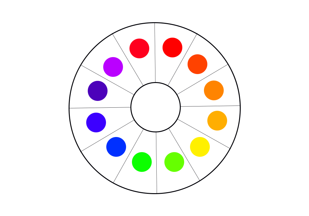
The Color Wheel

The color wheel reflects the primary colors (any color that cannot be made from the combination of other colors), the secondary colors (colors derived from mixing two primary colors or additive primary colors in equal proportions) and tertiary colors (colors derived from the combination of a primary and secondary color in equal proportions).

The color wheel is the foundation of any brand’s color application for design, as well as its brand identity and colors choice; whether you choose to make use of primary, secondary or tertiary colors or other colors that can be derived from the combination of any of these three.
This Includes the use more or less saturation (lightness, with the combination of the white hue and any other color) or more of less value (darkness, with the combination of the black hue and any other color).

Your choice of colors should reflect your brand’s values and the kind of image it intends to project to its target audience.

This is why certain well-known global brands, as well as smaller brand have over time selected specific colors for their brand identity.
As we go through the meaning of some predominant colors, think of well-known brands and why they may have selected certain colors to represent their business.

Below are summaries of some of the most principal colors and their meanings.


The Primary Colors

Red, know to reflect: Passion, energy, love, romance, danger, style, excitement, pain, bravery, active, bold, power, ambition, youthfulness and assertiveness.

Yellow, know to reflect: Joy, cheerfulness, friendliness, intellect, energy, warmth, caution, optimism, understanding and smartness.

Blue, known to reflect: Stability, leadership, trust, responsible, truth, confidence, calmness, tranquility, affection, success, loyalty, authority, peace and sincerity.

The Secondary Colors

Orange, known to reflect: Creativity, productivity, thoughtfulness, warmth, instinct, freedom, impulse, motivation and new ideas.

Green, known to reflect: Growth, clarity, generosity, freshness, life, money, safety, healing, environment, hope, youth and nature.

Purple, know to reflect: Vision, royalty, diplomacy, fashion, dignity, passion, spirituality, luxury, wisdom, magic, plentiful and loyalty.

Other Dominant Colors

Black, known to reflect: Sophistication, power, mystery, death, grief, strength, finesse, subtlety and infinity.

White, known to reflect: Purity, cleanliness, peace, goodness, simplicity, hope, freshness, light and coolness.

Gold, known to reflect: Supremacy, royalty, creativity, warmth, loyalty, friendliness, loyalty and strength.

Silver, known to reflect: stability, authority, security, strength of character and maturity.


Color Use and Branding

After examining all of these colors and some of their generally acceptable meanings. You may be very tempted to make use of a lot of them for your brand representation. This is quite understandable, since many of them reflect some very good and desirable qualities and values.

However, this is not always the smartest route, especially when choosing colors that would in the long run reflect your brand’s values, style, creativity and organization.

Your vision and mission statement for your brand, as well as service offerings should be carefully considered before the choice of brand colors are made, such that your color choices remain pleasing to the eyes and reflect balance.

Below are some formulas that can help you decide on how you could combine certain colors, taking into consideration the color theory rules and application.


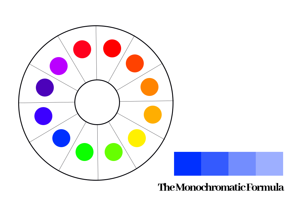
The Monochromatic Formula

This entails that the application of a single hue from the color wheel, with the combination of more or less saturation or value. Say you picked a blue hue.
You would eventually have a variety of that specific shade of blue to be applied consistently across your brand identity, designs and brand assets.

Think of brands you know that may have applied this concept, that would help with more insight.
See the image sample below for better understanding.


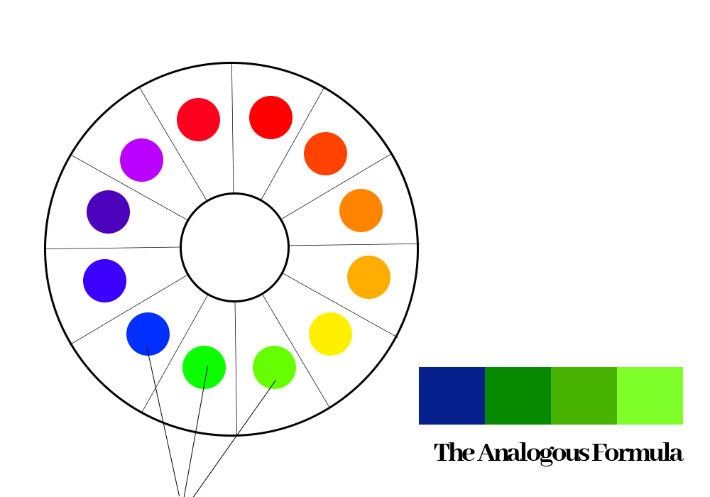
The Analogous Formula

This entails the application of three hues that appear next to each other on the color wheel, with the combination of more or less saturation or value of any of these hues selected.
This gives your brand a lot of creative room for color application and use for your brand identity, designs and brand assets.

Think of brands you know that may have applied this concept, that would help with more insight.
See the image sample below for better understanding.


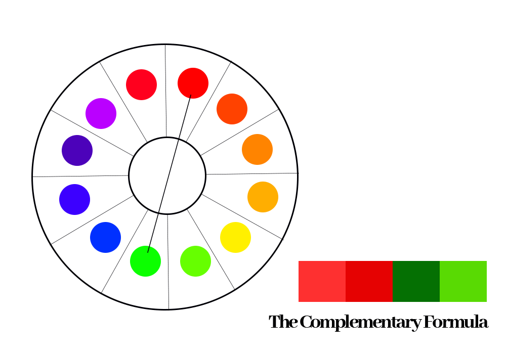
The Complementary Formula

This entails the application of any two colors directly opposite each other on the color wheel with the combination of more or less saturation or value. Say you picked a red hue, the complimentary color for this hue on the color wheel will be the green hue.

You could decide to apply these two selected complementary colors using a specific saturation or value consistently across your brand identity, designs and brand assets.

Think of brands you know that may have applied this concept, that would help with more insight.
See image sample below for better understanding.


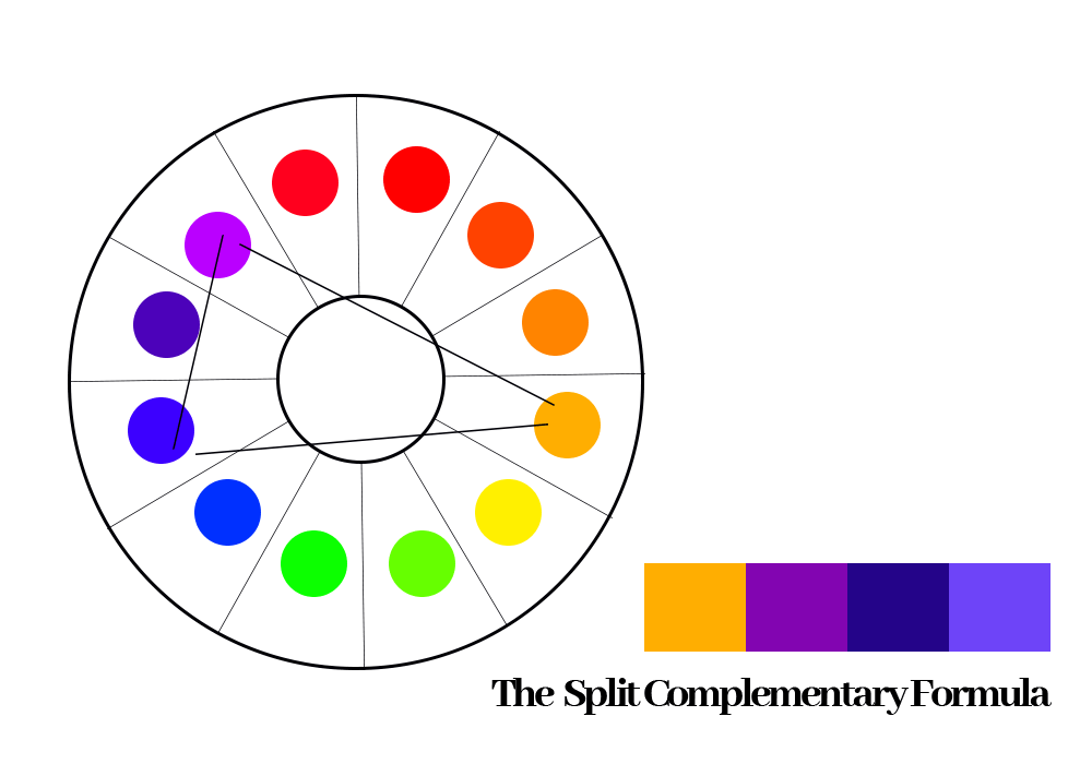
The Split Complementary Formula

This entails the application of any hue on the wheel and two opposite colors to it on the color wheel, with the combination of more or less saturation or value.
Say you picked the orange hue on the color wheel. The split complementary colors for orange would be the green and blue hues.

You could choose to apply these three selected hues using a specific saturation or value consistently across your brand elements, designs and brand assets.

Think of brands you know that may have applied this concept. This should help with more insight and creativity.
See image sample below for better understanding.


The Triadic Formula

This entails the application of any three (3) equally spaced hues from the color wheel, using a triangular method of selection (an equilateral triangle).

This can be a very dicey method of color application, however care must be taken to ensure that the three selections are not hard to the eyes and remain balanced.

This can be achieved by applying more or less saturation or value to the three selected colors.
Think of brands you know that may have applied this concept. This should help with more insight and creativity.

See image sample below for better understanding.


The Tetradic Formula

This entails the application of any four (4) hues from the color wheel, using a rectangular method of selection.

This also has to be selected carefully using a suitable saturation or value of the selected hues and applied across the brand identities, designs and brand assets.

Think of brands you know that may have applied this concept. This should help with more insight and creativity.
See image sample below for better understanding.


Conclusion

Even though these are great formulas that can be followed when creating designs for your brand’s assets or designing in general.

Don’t be afraid to think outside the box or try something new or unique.

Remember, there is beauty in moderation and balance, but there is also a beauty that comes with variety. As long as your choice of colors are balanced and have great contrast, without being hard to the eyes. This ensures that such designs or branding efforts remain attractive, irrespective of your colors choices.

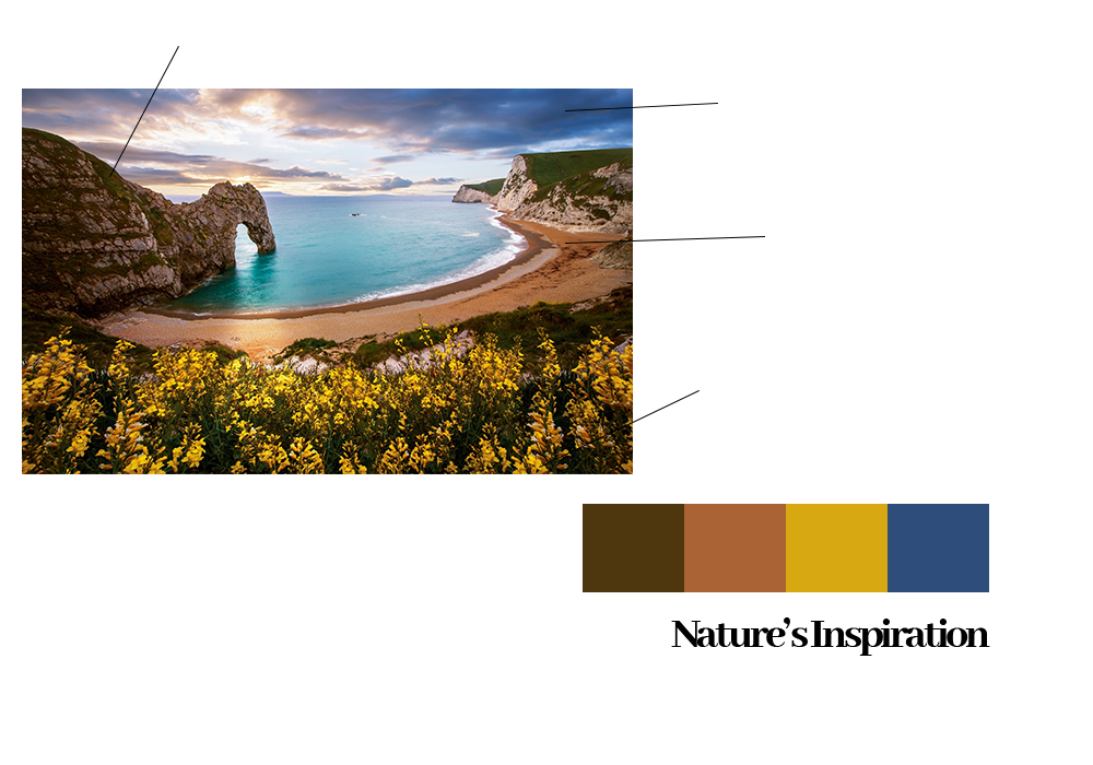
Don’t also be skeptical about nature’s inspirations.

Some of the best designs and color combinations of all time for some brands have been obtained from the natural things around us.

Also remember to generously make use of neutral colors: white, black and grey (using a saturation or value of hue that comes off as most suitable for each design) to bring balance to your all of your branding and design efforts.

We hope all of these information remains helpful in making concrete decisions about your choice of brand colors for your brand identity and design efforts.


Article by Opeolu Adeyemi.
Corporate Communications and Public Relations Consultant
Founder, Brave Publicity Ink!